
Help!
Where does everyone buy their coloured card from in the UK.
I keep seeing beautiful cards with ombre shades of cardstock , you know the ones, where each colour has it's own name. I'd love to be able to get some, but I can't afford the - £3.50 for 5 sheets in 60 different colours! Is there a more economical make that anyone has come across. I'd love to know.
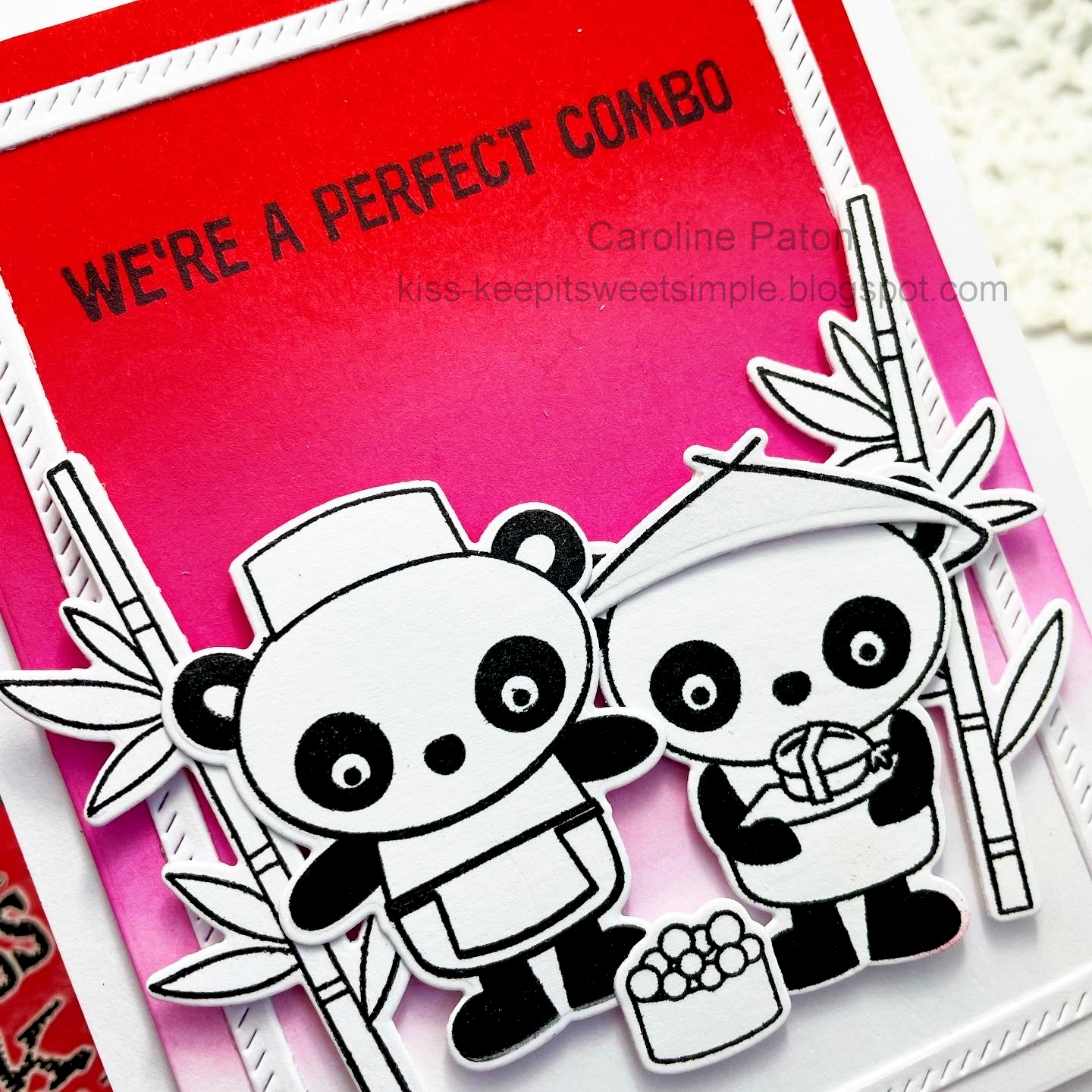
I ditched my miss matched, card colours for this make, and went with distress ink instead.

I chose the bold distress inks of festive berries, and pickled raspberry, and was surprised how well they blended. Then I held my breath, and stamped the sentiment.
The little Pandas and their extras were stamped, die-cut and popped up with foam pads. I nearly coloured in some red on the apron and hat, but stopped myself and i think the plain black and white works well.
Challenge

mft - sushi date
pinkfresh studio - diagonal stitch rectangle
distress ink - festive berries, pickled raspberry
3 comments:
What a cute twist to a Valentine!!! Love the black and white against your ombre background. Wish I could help with the cardstock dilemma but I'm in the US. Thanks so much for playing with us at the Color Hues challenge blog!
Fantastic card! The background blending is lovely and those pandas are super cute! I agree, leaving the image b & w does work well. Sorry, I can't help with the paper sourcing....I could tell you where I get mine in Canada (though I've not seen the ombre), but I bet that wouldn't make it more economical for you. (:
Caroline your card is so adorable! Those panda bears are just the sweetest and your ink blending is lovely! Thank you so much for sharing with us at the Color Hues!
Post a Comment